Final Cut Pro vs Premiere Pro - User Interface
USER EXPERIENCE
The first time you open a new software it can feel a bit intimidating and sometimes you don’t even know where to start. There are dozens of options to choose from but there are two that stand out from the crowd and among video editors this has been a debate since the release of the two programs. Adobe’s Premiere Pro vs Apple’s Final Cut Pro, they are probably the two most commonly used and best rated video editing software for the majority of creators. So let’s compare and deconstruct the two and see how they stack up against one another from a general user perspective.
FINAL CUT PRO
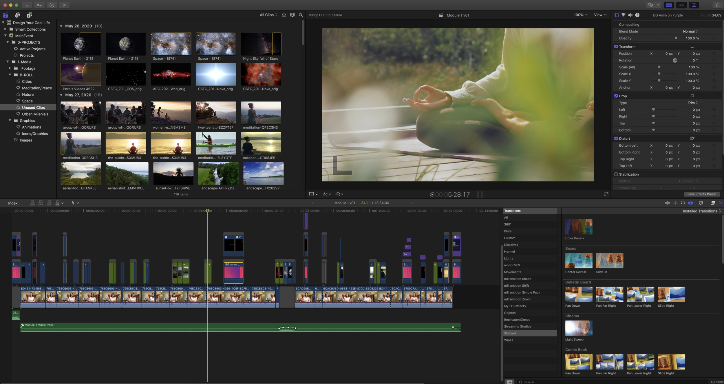
To start, Final Cut has by far the most intuitive and friendly user interface. It uses a trackless magnetic timeline instead of a traditional timeline. So instead of tracks, Final Cut uses lanes with a primary storyline that everything attaches to. This makes keeping everything organized and synced easier than in Premiere Pro. It’s also put together in such a way that will make more sense to the first time user. The downside to this is that the interface is less configurable than Premiere’s. They only offer four predefined workspace settings which include default, browser, timeline, and inspector. So you won’t be able to split panels into separate windows like in Premiere Pro. For content organization Apple also takes a different approach from the traditional layout. It starts with the FCPX library that is the container for all your data including projects, events, and clips. They use keyword tagging to help organize your files and keep to help keep track of everything.
SUMMARY
Final Cut Pro is great for anyone that is already editing and just looking for a new software or someone who is just staring out. It has a simple design and is very intuitive for the first time user. There is a short learning curve but still offers high end tools and features and has a lot to offer with being integratable with plugins and with its very competitive price.
PREMIERE PRO
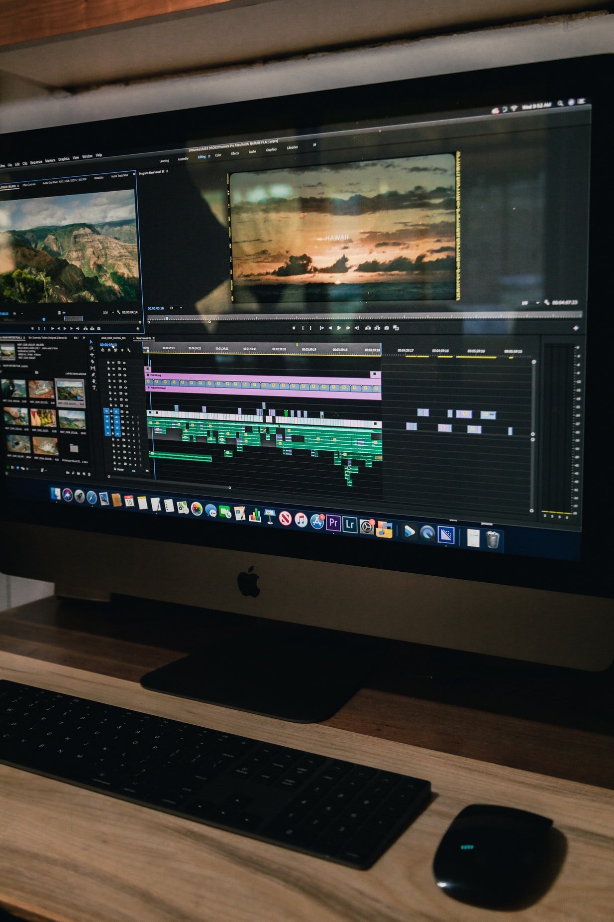
Premiere Pro utilizes a traditional NLE (non-linear editing system) timeline which is called a sequence. Within each sequence is where you will place your audio and video content on tracks. Clips are not connected like Final Cut's magnetic timeline, but if a video clip has audio linked to it, it will stay linked together in the sequence. The Adobe interface is much more configurable then Final Cut Pro. You can customize it in almost any way you desire by docking and undocking panels and by having multiple different workspaces for different projects and tasks like editing, color, graphics, or assembly. For content organization just like many NLE editing softwares Premiere Pro uses bins to store media. Just like folders you can store bins inside bins and color code them for ease of use. This is where you will store all your assets, videos, and audio clips and also allows you to share between multiple Adobe apps like After Effects. Premiere Pro isn’t quite as intuitive as Final Cut Pro and is more targeted to experienced video creators. They gave up some user experience to create a more organized structure so you can find files, layers and assets more easily. You might find that everything is more clearly laid out and separated once you get the hang of the menus in comparison to Final Cut Pro.
SUMMARY
Premiere Pro is a great choice for someone that has some experience with editing and wants full control of the software. It has an extremely customizable interface that allows you to create a workspace for almost every project. It has a more structured organization process that also allows you to share media between different Adobe applications and has a wide range of different plugins to further improve the software.
CONCLUSION
At the end of the day you can’t really go wrong with either. Both Final Cut Pro and Premiere Pro are remarkably powerful tools that offer a wide range of features. Both are great for professional and home creators that are just starting out. Find out what tools people are using in the industry that you want to grow into and that will help position you for a successful career. We expect everyone at Partners in Post to know and master both! But obviously it comes down to personal preference on which is more accommodating for your situation. When making your decision, consider the types of workspace and integration features. What projects you will be working on, will you be alone or in groups? Take these all into consideration when deciding which is the better tool for your needs.


